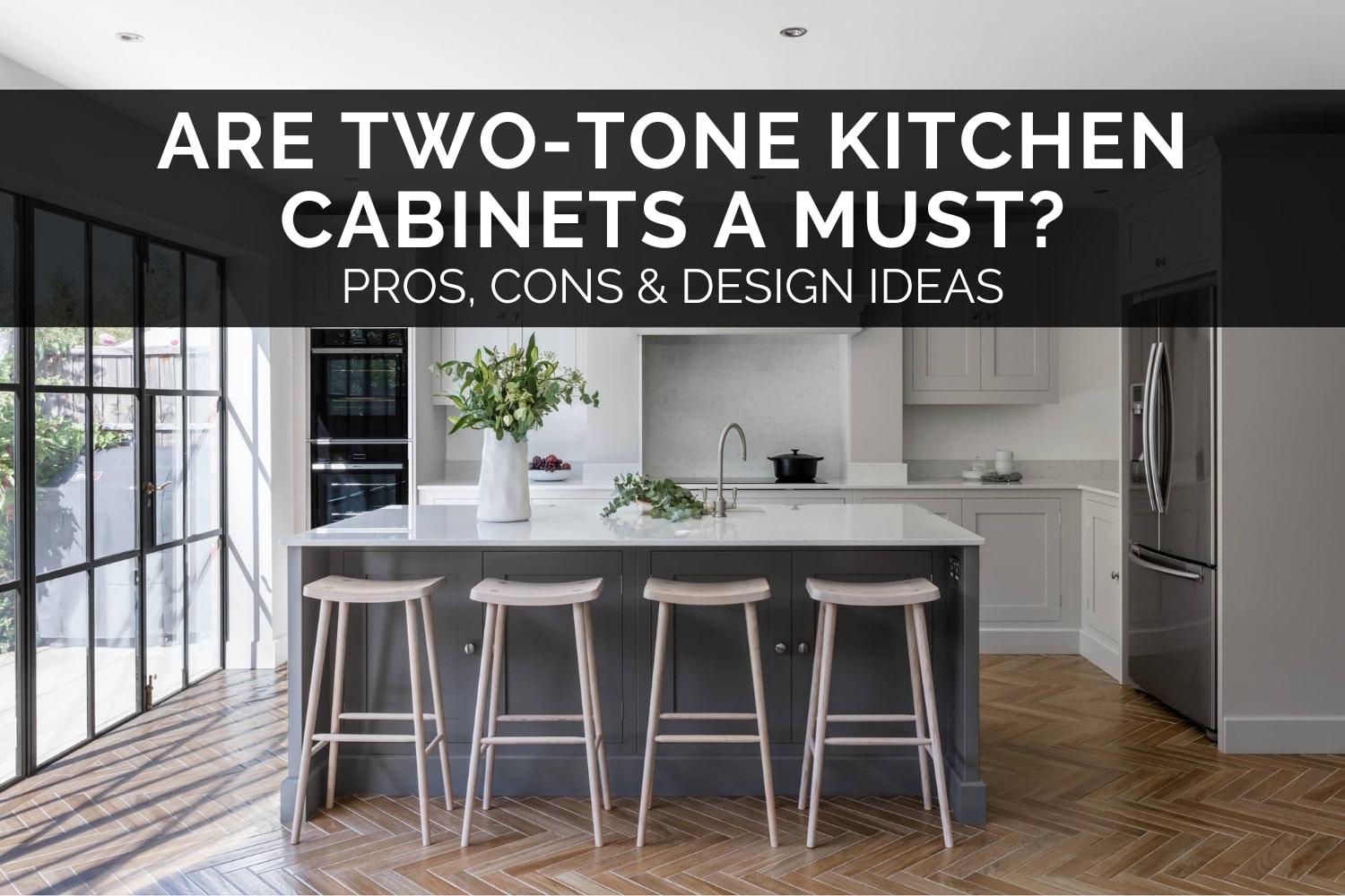
Are Two-Tone Kitchen Cabinets A Must? – Pros, Cons & Design Ideas
Two-tone kitchen cabinets have become one of the most popular design choices in recent years, and it’s easy to see why. Mixing two different colours or finishes instantly adds depth, character, and personality to a kitchen without needing anything too bold or over the top.
But if you’re planning a new kitchen, you might be wondering whether this is just a passing trend, whether it suits every style, or if it’s tricky to get right. The truth is, two-tone cabinetry can look incredible when it’s well thought-out, and a little chaotic when it’s not.
In this post, I’ll walk you through everything you need to know before deciding. We’ll look at the benefits and potential drawbacks, how to choose the right colour combinations, and practical design ideas to help you create a kitchen that feels balanced and timeless.
In a hurry? Here’s my key takeaway:
🏡 Two-tone kitchen cabinets can add depth, contrast, and personality to your kitchen, but the key to success is choosing the right colours, placement, and overall balance for your space.
Read on to learn more…
You May Also Like
Timeless Kitchen Colour Palettes – Inspiration & Ideas
What Are Two-Tone Kitchen Cabinets?
Two-tone kitchen cabinets simply mean using two different colours, materials, or finishes within the same kitchen. Instead of everything matching perfectly, you intentionally introduce contrast to create visual interest and variation.
The most common approach is lighter wall cabinets paired with darker base cabinets. This keeps the space feeling open at eye level while grounding the design below. Other variations include a contrasting island, tall units in a deeper shade, or mixing materials like timber grain with painted doors. Some designs even blend matte and gloss finishes for subtle texture differences.
The goal isn’t to overwhelm the room but to create a layered, curated look that feels more dynamic and designed. When done well, two-tone cabinetry can bring warmth, structure, and a sense of personality to your kitchen that a single colour sometimes can’t achieve.
Why Consider a Two-Tone Kitchen?
Two-tone cabinetry has become so popular because it offers the perfect blend of style and practicality. Instead of a single block of colour, you get a kitchen that feels more layered, more intentional, and far more visually engaging. If you’re looking to add personality without going overboard, this approach can be a brilliant solution.
1. Adds Visual Interest and Depth
Using two different colours instantly brings life to your kitchen. It breaks up a uniform run of cabinets and helps the space feel more dynamic. Even a subtle shift — such as soft grey bases with white uppers — can add a level of depth that a single-colour kitchen often lacks.
2. Helps Define Zones
Two-tone kitchens work especially well in open-plan homes. Changing colour on the island or tall units helps define separate areas without adding physical barriers. It’s a simple but clever way to anchor your layout and make the room feel more structured.
3. Makes Small Kitchens Feel Bigger
If your kitchen is on the smaller side, this design trick can make a noticeable difference. Lighter upper cabinets keep things bright and draw the eye upward, while darker base units ground the room. The result is a kitchen that feels more spacious and less top-heavy.
4. Allows You to Introduce Warmth or Contrast
Two-tone designs give you the chance to balance warmth and coolness. For example, rich timber base units can soften crisp white uppers, or a deep navy island can add dramatic contrast to an otherwise neutral kitchen. It’s a great way to play with mood and texture.
5. More Creative Freedom
If you’ve been tempted by a bold colour but aren’t ready to commit to an entire kitchen of it, this is the perfect middle ground. You can introduce a statement shade on the island or lower cabinets and keep the rest of the space timeless.
Potential Drawbacks to Be Aware Of
A two-tone kitchen can look incredible when done well, but like any design choice, it does come with a few considerations. None of these are deal-breakers; they’re just things to keep in mind so your final result feels balanced and cohesive.
1. Can Look Busy if Not Planned Carefully
Using too many colours or tones that don’t sit well together can make the kitchen feel disjointed. A successful two-tone design usually sticks to one dominant colour and one supporting colour to keep the look intentional.
2. Needs Strong Coordination with Worktops and Flooring
When you introduce a second colour, you also introduce a second set of undertones. This means your flooring, worktops, and walls all need to harmonise with both shades. It’s definitely achievable — it just takes a little more care during the planning stage.
3. Risk of Dating the Kitchen
If you choose a very trendy or specific accent colour for your secondary tone, it might date the kitchen faster than a timeless, neutral palette. It’s best to use bold colour on areas that are easier to repaint later (like an island) or stick to classic pairing colours (like navy, charcoal, or forest green).
4. Marginally Higher Cost
While not a major difference, some custom cabinet makers or large manufacturers may charge a nominal fee (often 5-10% extra) for having to process and finish two distinct colours, as it requires a changeover in the manufacturing process.
How to Choose the Right Two-Tone Combination
Choosing colours is the fun part, but getting the combination right is what makes a two-tone kitchen look intentional rather than accidental. Here are the principles I always follow when designing this style.
1. Start with the Colour You Love Most
Begin with your “hero” colour. The shade you’re naturally drawn to. This might be a deep navy, a warm timber, or a soft sage green. Once you’ve chosen that anchor colour, pair it with something complementary or neutral to balance the look.
Starting this way not only simplifies the process, but it also ensures the kitchen reflects your personal style rather than trends alone.
2. Use the 70/30 Rule
A well-balanced two-tone kitchen typically follows the 70/30 principle.
Let around 70% of the cabinetry be your dominant colour, while the remaining 30% becomes the accent.
This ratio keeps the design cohesive. Without it, the kitchen can start to feel visually noisy or disjointed. It doesn’t need to be exact, but the idea is to give the eye a clear hierarchy.
3. Think About Light Levels
Lighting massively impacts how colours appear.
If your kitchen is north-facing, shaded, or relies heavily on artificial light, lighter or warmer tones help prevent the space from feeling dull.
Darker colours such as charcoal, bottle green, or deep blue can look stunning, but they truly shine in kitchens with generous natural light or layered lighting schemes.
As a rule of thumb:
Less light = lighter colours. More light = more freedom to go bold.
4. Keep Undertones Consistent
Even neutrals have undertones. Grey might lean blue, green, or beige; white might be cool or creamy.
Mixing warm and cool undertones unintentionally is one of the fastest ways to make a palette feel “off.”
Always compare samples side-by-side under the lighting in your actual kitchen.
If all your tones lean either warm or cool, the whole scheme will feel cohesive and intentional.
5. Coordinate with Worktops, Floors and Walls
Two-tone cabinetry is only one part of the overall palette. The bigger picture matters just as much.
Before committing, gather all samples:
• cabinet doors
• worktop finishes
• flooring options
• wall paint
• tiles (if relevant)
Lay them out together and check how each colour interacts. A two-tone scheme that looks perfect in theory can fall apart if the flooring or worktop clashes. Harmony across all surfaces is what creates a polished, designer-quality finish.
Where to Place the Dark and Light Colours?
Here are the most reliable layouts. They work across a wide range of kitchen sizes and styles.
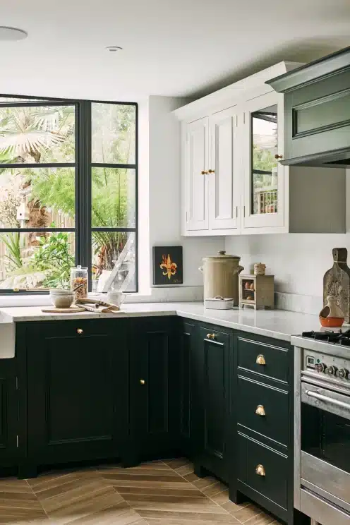
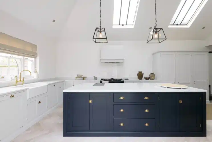
1. Dark Base Cabinets + Light Upper Cabinets
This is the most timeless and popular configuration, and for good reason.
Light upper cabinets keep the room feeling bright and open, while darker base units add grounding and depth. It’s especially effective in smaller kitchens, where too much dark cabinetry at eye level can make the room feel closed in.
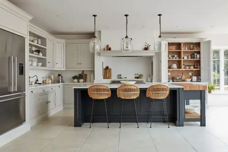
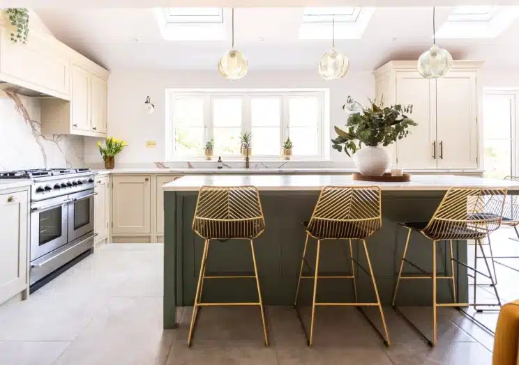
2. Dark Island + Light Perimeter Units
Perfect if you want your island to be the star of the show.
A darker island anchors the room visually, while the lighter perimeter units maintain a sense of spaciousness. This approach works beautifully in open-plan layouts, where the island naturally becomes the social centre.

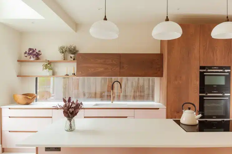
3. Light Lowers + Wood Uppers (or vice versa)
This combination gives a soft, Scandinavian-inspired feel.
Wood tones introduce warmth and texture, while painted cabinets keep the design clean and modern. It’s a great solution for anyone who wants a cosy, organic look without committing to an all-wood kitchen.

4. Statement Tall Units
Tall pantry or appliance housings are excellent candidates for a bold accent colour.
Because they sit on one wall, they can handle deeper or richer tones without overwhelming the rest of the space. It’s an easy way to add drama while keeping the kitchen practical and balanced.
Best Colour Pairings for Two-Tone Kitchens
Here are some tried-and-tested combinations that work across both classic and contemporary kitchens:
White + Navy
Classic, crisp, and always in style. A great option for bright, modern spaces.
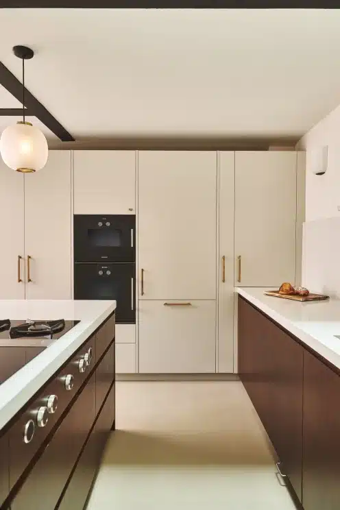
Black + Wood
A warm, luxurious mix that adds instant sophistication.

Cream + Sage Green
Soft and calming — a perfect fit for farmhouse, cottage, or traditional kitchens.
Dusty Pink + Walnut
Warm, elegant, and surprisingly timeless when done subtly.
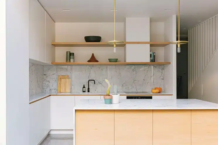
White + Natural Oak
Clean, bright, and effortlessly timeless. Works beautifully in almost any home.
Final Thoughts
Two-tone cabinetry isn’t just a passing trend. It’s a flexible, reliable design approach that can elevate almost any style of kitchen, from modern and minimalist to warm and traditional.
When you balance your colours well and think carefully about lighting, layout, and surrounding materials, the result is a beautifully layered look that feels intentional and long-lasting.
If you’ve been tempted to try a two-tone scheme, it’s absolutely worth exploring. With the right palette and placement, it can add personality and depth without overwhelming the space. 😃
FAQs: Two-Tone Kitchen Cabinets
Is a two-tone kitchen still in style?
Yes. It continues to be one of the strongest kitchen design trends because it’s versatile, timeless, and easy to personalise. When done well, it won’t date quickly.
Should the darker colour go on the top or the bottom?
Darker colours typically work best on the base cabinets because they help ground the room. However, islands and tall units are great places to flip the rule and use darker tones as accents.
Does two-tone work in small kitchens?
Absolutely. Light upper cabinets combined with darker lowers can make a small kitchen feel taller and more open.
Can you mix wood with painted cabinets?
Yes, and it’s one of the most popular two-tone combinations. Wood introduces warmth and texture, while painted cabinets keep the look clean and modern.
Will two-tone cabinets date quickly?
Not if you choose classic, well-balanced colours. Neutral pairings like white and navy, grey and charcoal, or oak with soft cream tend to feel stylish for many years.
DISCOVER MORE
- Open Shelving Or Glass-Fronted Cabinets? – Pros, Cons & Advice

- Kitchen Colour Trends 2026 – What’s Actually Popular
- Kitchen Window Treatments – 10 Popular Options To Consider


Author

Michael is a kitchen designer from the UK. He's been designing and project managing new kitchen installations for over 10 years. Before that, he was an electrician and part of a team that fitted kitchens. He created Kitchinsider in early 2019 to help give people advice when it comes to getting a new kitchen.