The End Of The White Kitchen? – Why Colourful Cabinets Are Replacing White
For more than a decade, the all-white kitchen has dominated renovation trends, builder packages, and social feeds. I remember when white felt like the only choice. It was safe, clean, and universally appealing.
But are its days now numbered?
In real homes and in design circles, the shine began to fade. White kitchens often feel clinical, and the constant chore of keeping them spotless became exhausting.
We started seeing the same look everywhere we scrolled, and eventually, that visual fatigue set in. I feel like many clients, myself included, began wanting spaces with genuine personality, warmth, and character.
That’s why colour, which once felt like a bold design risk, has quietly become the sophisticated standard. We now seem to be embracing colourful cabinetry as a fresh, modern, and individual alternative that finally gives the kitchen the unique personality it deserves.
In a hurry? Here’s my key takeaway:
⚪ The era of demanding, clinical all-white kitchens is ending, replaced by a confident move toward colourful, warm, and highly personalised spaces that are built for living, not just looking pristine.
Read on to learn more…
You May Also Like
Why Everyone’s Tired Of Perfect Kitchens
Why We’re Moving Away From All-White Kitchens
White Kitchens Are High Maintenance
While beautiful on installation day, white shows everything: mucky fingerprints, splashes, scuffs, and cooking residue. Glossy white doors reflect smudges instantly, while matte white doors can dull or stain over time. For families and busy households, an all-white kitchen can feel like a never-ending maintenance project, more stressful than enjoyable.
We Want Warmth and Personality
Interiors across the home are trending toward richer colours, natural textures, and softer, moodier palettes. The pure white kitchen often feels cold or overly controlled in comparison. After years of minimalist perfection, we increasingly want kitchens that feel lived-in, expressive, and emotionally comforting. Colour adds atmosphere, grounding, and a sense of individuality that white often struggles to deliver.
Design Fatigue With Cookie-Cutter Looks
Scroll through any feed, and you will see the same white Shaker doors with the same subway tile and the same styling details. The sameness has led to a sense of visual fatigue. We want kitchens that reflect us, not a preset template copied thousands of times. Even subtle colour choices instantly communicate intention and thoughtfulness, making the kitchen feel more curated and less generic.
Colour Feels More Bespoke
You don’t need bold colour to create impact. Soft greens, muted blues, and warm neutrals already feel more custom than white. These tones suggest a considered palette, an understanding of undertones, and a deliberate pairing of cabinetry with stone, timber, and lighting. Colour signals design confidence and craftsmanship in a way that white no longer uniquely claims.

You May Also Like
How To Choose The Perfect Colour For Your Kitchen Cabinets
Alternative Cabinet Colours And Finishes
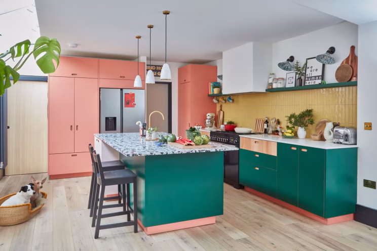
Greens

Forest, olive, sage, and eucalyptus greens continue to dominate. These tones feel inherently connected to nature and suit both contemporary and traditional kitchens. They pair beautifully with contrasting hardware (brass, black, antique bronze) and work equally well with pale timber or heavily veined stone. They have cemented their place as the versatile new baseline.
Blues and Blue-Greys

Instead of the bold navies of previous years, kitchens are now embracing softer, more atmospheric shades such as denim grey, storm blue, and slate. These colours feel refined, instantly calming, and exceptionally easy to coordinate with white oak flooring, brushed nickel fittings, or marble-look quartz. They offer sophistication without the drama.
Warm Earthy Neutrals

The biggest tonal shift is the profound movement toward mushroom, taupe, putty, and soft greige. These warm neutrals are quickly becoming the new baseline, offering the softness of colour with the calm simplicity of a neutral interior. They look inherently timeless and hide daily marks more gracefully than pure white.
Charcoal and Inky Tones

Deep charcoals and almost-black kitchen cabinets are rapidly rising in popularity. Far from looking heavy, they bring a sense of tailored luxury, dramatic depth, and unexpected cosiness. They hide marks exceptionally well and contrast beautifully with natural timber, warm lighting, or creamy stone surfaces.
Warm Timber Finishes

Natural wood finishes are seeing a significant resurgence, not as traditional country style, but as a textural alternative to paint. Light oak, walnut, and warm ash are increasingly popular for creating grounding, mid-century modern, or contemporary looks.
Timber is often used for island bases, open shelving, or a bank of tall units, balancing painted perimeter cabinets (e.g., green or blue) and adding unmatched warmth, tactile texture, and timelessness to the space.
Benefits Of A Colourful Kitchen
- They Hide Wear and Tear Better: Most mid to deep cabinet colours or natural wood finishes conceal everyday marks, fingerprints, and small scuffs far better than white. This makes colourful kitchens genuinely lower maintenance in busy, active homes. Matte finishes further disguise imperfections more effectively than high-gloss.
- They Age Gracefully: Colour tends to stay visually pleasing over time because subtle changes in the finish, patina, or tone do not stand out as dramatically as they do in white. Even if a cabinet door experiences minor fading or knocks, the overall kitchen still looks robust and cohesive.
- They Add Depth to Open-Plan Spaces: In open-plan living areas, white can flatten and disappear the kitchen. Colour helps to define the kitchen zone, especially when the cabinets sit near dining or lounge furniture. A thoughtful palette helps the kitchen integrate smoothly into the surrounding environment, making the whole space feel more considered.
- They Offer More Styling Flexibility: Colourful cabinetry creates a stronger, more sophisticated foundation for metal finishes, stone choices, and decorative details. Brass stands out beautifully against green or charcoal. Polished nickel looks sharp with smoky blues. Timber shelves look richer against warm neutrals. Colour opens the door to more harmonious and layered design combinations.
How To Use Colour Strategically
To move beyond white without fear of commitment, we rely on established, low-risk strategies that guarantee a sophisticated and enduring result.
1. Two-Tone Cabinetry and Coloured Islands
I often use colour on the lower (base) cabinets or the central island and keep the upper cabinets neutral or white. This is the simplest way to introduce personality while maintaining visual lightness and airiness in the room. A deep green or blue island creates a powerful, grounding anchor without needing full-room colour, drawing the eye and adding sophisticated interest.
2. Anchor the Palette With Stable Neutrals
If you love colour but worry about commitment, use it in combination with stable, timeless tones. Warm whites, soft greys, and pale greiges create a grounding base that allows coloured cabinetry to shine without overwhelming the room. This method keeps the palette balanced and ensures your kitchen still feels bright and open.
3. Soft Tones Instead of Saturated Hues
Many designers avoid bright, saturated colours and instead choose gentle, ‘muddy’ tones that behave like sophisticated neutrals. These colours feel timeless and are easy to live with, yet still far more expressive than pure white. They are your best bet for longevity.
4. Balance Strong Colours With Essential Texture
If you choose a bold cabinet colour, always pair it with tactile materials that soften and elevate the look. Timber accents, natural wood islands, handcrafted tiles, linen blinds, and brushed metal hardware all bring essential depth and quiet luxury. Texture is key to ensuring even the boldest palette feels warm, grounded, and considered.
5. Use Colour in Low-Commitment Areas
For testing colour before committing fully, focus on elements that are easy to update. Feature walls, bar stools, pendant lights, and open-shelf styling allow you to experiment without long-term pressure. This approach also helps you understand how a colour behaves in your home’s natural lighting before you make a major investment.
6. Colour Blocking for Architectural Interest
For more contemporary spaces, we use colour blocking on tall units or appliance banks to create architectural interest. This works particularly well with handleless or flat-front cabinetry, turning storage into a deliberate design feature rather than a simple block of cabinets.
You May Also Like
8+ Ways To Add Texture To Your Kitchen Design
Maintenance and Practicalities
Coloured cabinets look amazing, but how they wear is just as important as how they look on day one. Here’s what really matters when it comes to day-to-day living and longevity.
Finishes: What’s Easiest to Look After
Satin and matte finishes are the most practical overall. They hide fingerprints and small scuffs well.
Gloss looks sleek, but it shows every mark and needs more frequent cleaning to maintain its pristine look.
How Different Colours Behave
Every colour has its own maintenance quirks. Dark shades can show dust quickly. Very pale colours show smudges and fingerprints. Mid-tones (like warm greige or sage green) are usually the easiest to keep looking clean and perform best in daily use.
Colours That Age Gracefully
Some colours are inherently timeless even as trends evolve. Navy, forest green, warm mushroom, stone, and taupe are reliable choices that continue to look good year after year, offering maximum aesthetic endurance.
Cabinet Finishes: Pros and Cons
| Finish Type | Primary Benefit | Maintenance/Durability | Key Consideration |
| Hand-Painted | Flexibility, easy to touch up/repaint. | Good for longevity, surface wear is manageable. | It can cost more initially, requires a skilled application. |
| Laminate | Extremely durable and colour-stable. | Resists heat, moisture, and daily wear best. Low maintenance. | Limited colour/texture options compared to paint. |
| Spray-Lacquer (MDF) | Flawless, seamless, high-end look. | Highly durable surface, but repairs are harder. | Chips/dents often need professional respraying to blend. |
If you want low maintenance, go for laminate.
If you want a finish you can touch up over time, choose hand-painted.
For a clean, seamless, furniture-like look, lacquer is beautiful, just be aware it’s more delicate.
Should You Worry About Resale Value?
I believe the market has fundamentally shifted. Buyers (myself recently included) are now less inspired by plain white kitchens and are increasingly drawn to spaces with designer-level colour choices. A well-executed coloured kitchen often feels more premium and memorable than a standard white scheme.
Deep greens, smoky blues, taupes, and greiges have proven to be long-lasting and widely appealing. These colours are not fleeting fads; they behave like neutrals but add depth and sophistication.
In my humble opinion, a colourful kitchen does not hurt resale value. A poorly planned kitchen does! Clashing tones, mismatched materials, or trends chosen purely for Instagram have the biggest impact on long-term appeal. I think a restrained, thoughtfully curated palette is both beautiful and market-friendly.
When White Is Still the Right Choice
Let me be clear, if you simply love the look of white, there is absolutely nothing wrong with that. White remains a classic for a reason. Here are the practical and aesthetic reasons why it might still be your strongest design ally:
- If You Need Maximum Light Reflection: For kitchens with small windows or limited natural light, white can still be your strongest ally. It actively bounces light, opens the space, and creates a clean, airy backdrop.
- If Your Home Leans Minimal or Contemporary: Ultra-modern homes with strong architectural lines often look best with crisp white cabinetry. It allows the architecture and surrounding materials to do the talking, keeping the kitchen seamlessly integrated.
- If You Prefer a Calm, Understated Palette: Some clients simply feel most at ease with soft, quiet tones. White remains a beautiful choice when thoughtfully combined with warm flooring, textured stone, and natural timber to avoid a sterile look.
- If You Plan Frequent Accent Changes: White cabinetry gives you the ultimate freedom to update wall colours, hardware, textiles, or lighting over time without needing a major renovation. It is the perfect neutral canvas.

Final Thoughts
White kitchens will always have a place, but the era of sophisticated colour is firmly here. We’re moving toward spaces that feel expressive, warm, and deeply personal. Colour can fundamentally transform the mood of a kitchen, add depth to open-plan spaces, and create a richer, more grounded sense of home.
Whether you commit fully to painted cabinetry or introduce colour in softer, strategic layers, the goal is the same. Design a kitchen that feels like you. Not one built for fleeting perfection. One built for living, cooking, hosting, and enjoying every single day!
DISCOVER MORE
- Can You Get A Right-Hand Hinged Washing Machine?

- Kitchen Window Treatments – 10 Popular Options To Consider
- Modern Farmhouse vs. Coastal Kitchen – Which Fits Your Home?


Author

Michael is a kitchen designer from the UK. He's been designing and project managing new kitchen installations for over 10 years. Before that, he was an electrician and part of a team that fitted kitchens. He created Kitchinsider in early 2019 to help give people advice when it comes to getting a new kitchen.