Colour Blocking In Kitchen Design – How To Get The Look
Colour blocking has been a staple in fashion and interiors for years, and it’s been quietly making its way into kitchen design too. If you’ve seen kitchens with a deep navy island sitting against pale sage cabinets, or a burgundy run of larders next to soft cream tall units, you’ve already seen colour blocking in action.
It’s bold, it’s confident, and when done well, it can completely transform how a kitchen feels.
But it’s not as simple as picking two colours you like and slapping them on opposite walls. There’s a bit of craft to making colour blocking work in a space you actually have to cook, eat, and live in.
In this post, I’ll walk you through what colour blocking actually is, why it works, and the approaches I use with clients when they want a kitchen that feels designed rather than decorated.
In a hurry? Here’s my key takeaway:
🎨 Colour blocking in a kitchen means using two or three deliberate, contrasting colours across cabinets, islands, walls, or worktops, to create visual structure and a designed feel, rather than blending everything into one safe palette.
Read on to learn more…
You May Also Like
Are Two-Tone Kitchen Cabinets A Must? – Pros, Cons & Design Ideas
What Is Colour Blocking In Kitchen Design?
Colour blocking is the technique of pairing two or more solid, distinct colours in large, deliberate areas to create contrast and visual interest. It started life in fashion (think 1960s Mondrian-inspired dresses) and moved into interiors as people got bolder with their colour choices.

Musée Yves Saint Laurent
In a kitchen, colour blocking usually shows up in one of a few ways:
- Island vs perimeter cabinets in two different colours
- Upper vs lower cabinets in contrasting tones
- Tall units or larders in a feature colour against neutral base cabinets
- A bold splashback or back wall against painted cabinetry
- A statement-coloured run of cabinets flanked by softer neutrals
The key word is deliberate. Colour blocking isn’t an accident or a happy clash. It’s a planned design choice where each block of colour has a purpose, whether that’s drawing the eye, breaking up a long run of units, or anchoring the space.
In my experience, the kitchens that pull this off best are the ones where the colour choices have been considered alongside the worktops, flooring, and lighting, not picked in isolation.
Why Colour Blocking Works So Well In Kitchens
Kitchens are one of the few rooms where you’ve got naturally large, flat surfaces just begging for colour. Cabinet runs, island sides, splashbacks, and tall unit fronts give you a genuine canvas to work with.
Here’s why I think colour blocking suits kitchens specifically:
- It breaks up monotony. A long run of single-colour cabinetry can feel flat, especially in larger kitchens. Blocks of contrasting colour add rhythm.
- It defines zones. In open-plan layouts, a different colour on the island can subtly mark out the kitchen from the dining or living area.
- It adds personality without clutter. You don’t need shelves of trinkets to make a kitchen feel like yours. Confident colour does the heavy lifting.
- It photographs beautifully. If you care about how your kitchen looks in photos (whether for Instagram, an estate agent, or just your own pride), colour-blocked kitchens are genuinely striking.
I always tell clients that a kitchen is the most-used room in the house, so it’s worth having one that actually makes you feel something when you walk in.
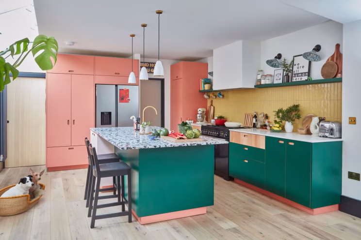
The Main Approaches To Colour Blocking A Kitchen
There’s no single way to colour block. Different layouts and tastes call for different approaches. These are the five I’d recommend starting with.
1. The Two-Tone Island
This is the gateway colour block. Most homeowners try it first because it feels manageable.
You keep your perimeter cabinets in a calmer, more neutral tone (think soft white, warm grey, pale sage, or muted stone), and the island becomes your statement, in a deeper or more saturated colour.
Why it works: the island is naturally the focal point of an open kitchen, so giving it visual weight makes sense. It also limits your “risk” colour to one piece of furniture, which is reassuring if you’re nervous about commitment.
Common pairings I’ve used:
- Pale sage perimeter, deep forest green island
- Warm white perimeter, navy or inky blue island
- Soft taupe perimeter, burgundy or oxblood island
- Cream perimeter, charcoal island
💡 Designer tip: If you’re going dark on the island, balance it with a lighter worktop to stop it feeling heavy. Quartz, marble-effect stone, or pale timber tops all work beautifully.
2. Upper And Lower Split
This is a classic colour blocking move, especially in older homes or galley kitchens where you don’t have an island to play with.
The idea is simple. Lower cabinets in one colour, wall units in another. Usually, the lower cabinets carry the heavier, deeper tone, and the wall units stay lighter to keep the space feeling open and airy.
I really like this approach in smaller kitchens because it tricks the eye into seeing more height. Light at the top, grounded at the bottom.
Common pairings:
- Olive green lowers, soft cream uppers
- Deep blue lowers, warm white uppers
- Charcoal lowers, pale grey uppers

3. The Feature Run
Here, you pick one wall or run of cabinets (usually the tall units or a bank of larders) and colour block that against a softer rest-of-kitchen palette.
This works really well when you’ve got a long single wall of cabinetry. Painting the whole thing in one bold colour can feel overwhelming, so instead, you let the tall units carry the colour and keep the lower runs neutral.
It’s a clever way to add drama without committing every surface to it. And in my opinion, it’s one of the most flexible approaches because the “feature run” can be almost any colour you fancy without overwhelming the space.
4. The Bold Splashback Or Back Wall
If painting cabinets in two colours feels like too much, the splashback is a brilliant place to colour block.
Tile, painted plaster, microcement, or even a slab of bold stone can deliver the colour-block effect without touching the cabinetry. The cabinets stay neutral, and the back wall does the talking.
Think terracotta zellige tiles, deep blue painted plaster, and even a chunky red marble slab. Each one completely changed the feel of the kitchen without being a “permanent” decision in the way painted cabinets feel.
💡 Pro Tip: If you’re using a bold splashback colour, pull a hint of that colour into one or two other elements (a vase, a stool, a piece of art) so it feels intentional rather than isolated.
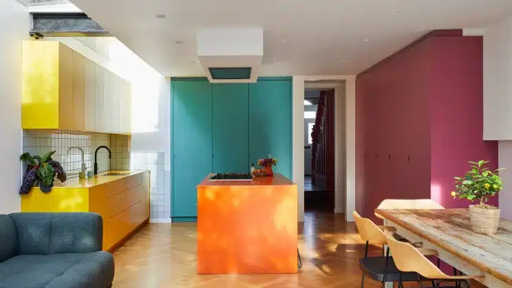
5. Three-Block Layering
This is the advanced level. Three deliberate colours, each holding its own block in the kitchen.
Usually this looks like: perimeter cabinets in colour A, island in colour B, walls or splashback in colour C. Done well, it feels rich and confident. Done badly, it feels chaotic.
The trick is in the proportions. One colour should dominate (typically 60% of the visible space), one should support (around 30%), and one should accent (around 10%). That’s a classic interior design ratio, and it really does work.
In my own design projects, I’ve found three-block layering works best in larger kitchens with plenty of natural light. In smaller spaces, two colours are plenty.

How To Choose The Right Colour Combinations
This is where most people get stuck, and honestly, where most colour-blocked kitchens go wrong.
Picking two colours you “like” isn’t enough. The colours have to talk to each other.
Here are the principles I lean on:
- Stay in the same temperature family. Warm with warm. Cool with cool. Mixing a cool grey with a warm cream usually looks slightly off, even if you can’t quite pinpoint why.
- Vary the saturation. If both colours are equally bold, they’ll fight. Pair one saturated colour with one muted one.
- Borrow from nature. Olive and cream. Navy and sand. Burgundy and stone. These pairings work because we see them together in the natural world.
- Test the colours in your actual space. Lighting changes everything. A colour that looks perfect in a showroom can feel completely different in your kitchen at 4pm in November.
I always recommend painting decent-sized sample boards (not little dabs on the wall) and propping them up in your kitchen for at least a few days. Look at them in morning light, evening light, and under your kitchen lighting.
💡 Designer tip: If you’re choosing between two combinations and can’t decide, look at what’s already permanent in the room: your flooring, your worktop, any exposed brick or stone. The colour scheme that complements those elements is almost always the right one.

Common Colour Blocking Mistakes To Avoid
I’ve seen colour blocking go wrong plenty of times. Usually it comes down to one of these:
- Picking colours that are too similar. If your “two tones” are basically the same colour, with one slightly darker, it just looks like you couldn’t decide. Commit to genuine contrast.
- Ignoring the worktop and flooring. These are the largest neutral surfaces in your kitchen, and they need to play nicely with your colour blocks.
- Forgetting about hardware. Brass, chrome, black, and brushed nickel each shift the feel of a colour. Choose hardware that ties your blocks together rather than fighting them.
- Trend chasing without considering longevity. That super-trendy colour might feel exciting now, but kitchens are a long-term investment. Make sure you genuinely love the colour, not just the Instagram pictures of it.
You May Also Like
Subtle Design Choices That Make A Kitchen Feel Expensive
When Colour Blocking Isn’t For You
I’ll be honest. Colour blocking isn’t for everyone, and that’s fine.
If you’re someone who genuinely prefers calm, tonal spaces with subtle variation rather than confident contrast, forcing a bold colour block in your kitchen will leave you uncomfortable in your own home. The same goes if you’re planning to sell within a few years (very bold colour choices can narrow your buyer pool, even if they’re well executed).
In those cases, a more tonal palette with subtle texture variation, different wood grains, or layered neutrals will serve you better. Colour blocking should feel like an expression of your taste, not a performance of someone else’s.
Final Thoughts…
Colour blocking is one of those design moves that looks effortless when it works and clumsy when it doesn’t. The difference almost always comes down to planning, restraint, and properly testing your choices in your actual space.
If you’re considering it, I’d say start with the two-tone island approach. It’s the lowest-risk way to dip your toe in, and you can always go bolder later.
The best colour-blocked kitchens I’ve designed (and seen designed) all have one thing in common: they feel intentional. Every colour has a reason for being there. That’s the standard worth aiming for.
Trust your eye, take your time on samples, and don’t be afraid to pull back if something feels too much. Your kitchen should feel like you, just with a bit more confidence.
FAQs
Is colour blocking the same as a two-tone kitchen?
There’s a lot of overlap, but they’re not quite the same. A two-tone kitchen specifically means two different cabinet colours (usually upper and lower, or perimeter and island). Colour blocking is broader; it can include cabinets, walls, splashbacks, and even worktops, and can use two, three, or more deliberate blocks of colour.
Will colour blocking date my kitchen quickly?
It depends on the colours you choose. Bold, on-trend colours (like the bright “Millennial pink” of a few years back) tend to date quickly. Earthier, more grounded colours (deep greens, navy, terracotta, burgundy, stone) have stayed relevant for decades. Choose timeless tones in confident pairings and your kitchen will age well.
Should I match my hardware to my colour blocks or contrast it?
Generally, your hardware should tie the colour blocks together rather than match either of them exactly. Brass works beautifully with warm palettes (cream, sage, burgundy). Black or chrome suits cooler palettes (navy, charcoal, grey). Choose one hardware finish across the whole kitchen for consistency.
DISCOVER MORE
- Kitchen Window Treatments – 10 Popular Options To Consider

- Modern Farmhouse vs. Coastal Kitchen – Which Fits Your Home?
- Colour Blocking In Kitchen Design – How To Get The Look


Author

Michael is a kitchen designer from the UK. He's been designing and project managing new kitchen installations for over 10 years. Before that, he was an electrician and part of a team that fitted kitchens. He created Kitchinsider in early 2019 to help give people advice when it comes to getting a new kitchen.