Kitchen Colour Trends 2026 – What’s Actually Popular
We’re about halfway through 2026 now, which feels like a good moment to take stock. At the start of every year, every magazine and paint brand puts out their “colours of the year” and predictions, and by this point, you can usually tell which of those predictions were right.
So I’ve had a proper look. I’ve gone through what the interiors magazines are saying right now, what’s trending in search, and what the big paint brands have picked as their colours of the year for 2026.
What’s interesting is that it’s not one single colour dominating. There are a few clear themes running in parallel, and once you see them, you start spotting them everywhere.
In a hurry? Here’s my key takeaway:
🎨 2026 is the year kitchens moved on from “safe” greys and whites towards warmer, richer colours, whether that’s gentle earthy neutrals like mushroom and taupe, or bolder statements in deep blue, aubergine, and olive green.
Read on to learn more…
You May Also Like
The End Of The White Kitchen? – Why Colourful Cabinets Are Replacing White
The Big Shift: From “Safe” To “Considered”
For a few years now, kitchens have been dominated by cool greys, crisp whites and that slightly clinical, minimalist look. It’s been the “safe” choice for resale value, and I get why. But in my experience, a lot of clients have started telling me they want their kitchen to feel a bit more like them.
That’s the thread running through pretty much every trend report I’ve read for 2026. Less “show home”, more “this is our home, and we actually like colour”.
It’s showing up in two main ways: warmer, softer neutrals as the new “safe” choice, and much bolder, deeper colours for people who want to make more of a statement. Let’s go through both.
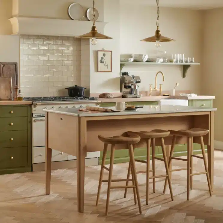
Warm Earthy Neutrals Are The New Greige
If 2020 to 2024 was all about cool greys, 2026 is firmly about warm neutrals. Think mushroom, taupe, oat, stone, clay and soft greige tones with a hint of pink or brown in them rather than blue or green.

- Mushroom: A soft, warm grey-brown that works brilliantly as a base colour for cabinetry. It pairs really well with both wood and brass.
- Taupe and greige: Slightly warmer cousins of grey, these feel cosier without tipping into “beige kitchen from 2009” territory.
- Oat, stone and linen tones: Lighter, creamy neutrals that I’d usually use on walls or upper cabinetry to keep a kitchen feeling bright.
Sherwin-Williams picked Universal Khaki as its 2026 Colour of the Year, which is a warm, sandy neutral that sits between beige and taupe with a subtle green undertone. It’s exactly the sort of shade I mean here. It’s versatile enough for cabinetry, walls, or even a kitchen island, and it won’t date the way some of the cooler greys from a few years ago already have.

💡 Designer tip: If you’re nervous about committing to a deeper colour, this is the trend to lean into. A warm neutral on your base cabinets, paired with a lighter version on the walls, gives you a kitchen that feels current now but won’t look dated in five years.
Deep, Moody Darks: Aubergine, Burgundy And Plum
Here’s where it gets a bit braver. Several of the big paint brands have gone properly dark and rich for 2026, and aubergine and burgundy tones in particular keep coming up.

Little Greene named Adventurer, a plum aubergine shade somewhere between burgundy and purple, as its first-ever Colour of the Year. Farrow & Ball hasn’t picked a single colour of the year in the same way, but its brand ambassador has pointed to Brinjal (a deep aubergine) and Preference Red as two of the shades driving sales this year, alongside the soft brown Mouse’s Back.
Benjamin Moore went in a similar direction with Silhouette, an espresso brown with charcoal undertones, which they describe as combining burnt umber with hints of charcoal.

In a kitchen, I wouldn’t usually recommend going all-in on a colour this deep across every cabinet (unless you’ve got a lot of natural light and you’re genuinely confident with colour). Where I’ve seen it work really well is on an island, on lower cabinets only, or on a single bank of cabinetry, paired with a warm neutral everywhere else.
💡 Pro Tip: Deep aubergine and burgundy tones look fantastic against brass or unlacquered brass hardware, and against warm wood worktops like walnut or oak. Avoid pairing them with cool white marble, which can make the whole scheme feel a bit cold and contrasty rather than cosy.
You May Also Like
Are Two-Tone Kitchen Cabinets A Must? – Pros, Cons & Design Ideas
Blue Is Still A Big Deal, But It’s Gone Deeper
Blue kitchens have been popular for years now, but the tone has shifted. Instead of the soft duck-egg or sage-adjacent blues that were everywhere a few years back, 2026 is leaning towards deeper, ink-toned blues.

Dulux chose its Colour of the Year for 2026 as a family of three blues, called Rhythm of Blues, which includes an airy light blue, a vibrant mid-blue, and a deep, meditative dark blue. It’s the first time Dulux has picked a family of colours rather than a single shade, which I think says something in itself. Blue isn’t one trend any more, it’s flexible enough to be a calming neutral or a bold statement depending on the depth you choose.
For kitchens specifically, I’d say the dark, ink-blue end of that family is where most of the interest is. A deep navy or indigo on an island or run of base units still reads as classic and won’t feel like a fad in a couple of years, in my opinion.
Green Keeps Going, But It’s Getting Earthier
Green kitchens haven’t gone anywhere, but the shade of green that’s popular has shifted again. The brighter sage and olive greens that were big a couple of years ago are still around, but the direction for 2026 is towards warmer, more earthy greens with a bit more yellow or brown in them.
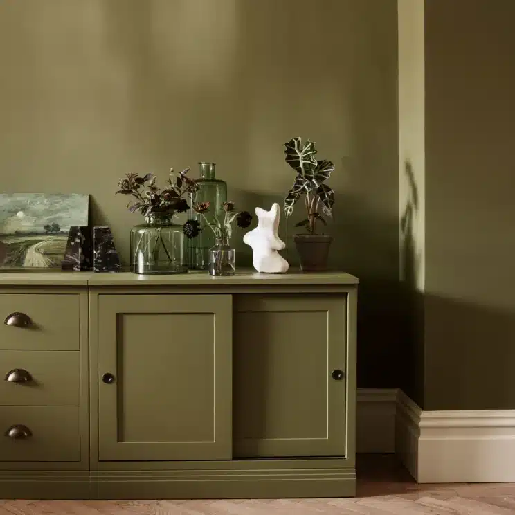
Neptune’s design director has pointed to warm, olive-toned greens as a strong direction for 2026, describing them as having a “heritage” feel that works in both modern and more traditional kitchens.
Behr’s Colour of the Year, Hidden Gem, takes things slightly further into blue-green territory with a smoky jade, while KitchenAid (yes, the stand mixer brand has its own colour of the year too) picked a minty green called Spearmint for 2026.
So if you already have a green kitchen from a few years ago and you’re wondering whether it’s “out”, I wouldn’t worry. Green as a colour family is still very much in. It’s just that the specific shade people are reaching for has warmed up a little.
💡 Pro Tip: If your existing green cabinets feel a bit cool or “minty” compared to the warmer olive tones that are trending now, you don’t need to repaint everything. Swapping cool white walls for a warmer cream or oat tone can shift the whole feel of the room without touching the cabinetry.
What Are The Big Paint Brands Saying For 2026?
To make this easier to compare, here’s a quick snapshot of what some of the major paint brands have picked as their Colour (or colours) of the Year for 2026.
| Brand | 2026 Colour Of The Year | Vibe |
|---|---|---|
| Dulux | Rhythm of Blues (a family of three blues) | Calm to bold, light to deep blue |
| Little Greene | Adventurer | Plum aubergine / burgundy |
| Benjamin Moore | Silhouette | Espresso brown with charcoal undertones |
| Sherwin-Williams | Universal Khaki | Warm sandy neutral with green undertone |
| Behr | Hidden Gem | Smoky jade blue-green |
| Farrow & Ball | No single pick, but trending towards Brinjal, Preference Red and Mouse’s Back | Deep aubergine, red and soft brown |
| Neptune | No single pick, but trend forecast points to warm, olive-toned greens | Earthy, heritage green |
A few things jump out when you line these up. Nobody has picked a bright, punchy colour this year. Even the boldest picks, like Adventurer and Silhouette, are deep, muted, and grounded rather than loud.
And there’s a real lean towards colours with a name that sounds like it belongs in a cocktail bar rather than a paint chart, which says a lot about the mood brands are going for: rich, a bit indulgent, but still calm.
Is There One Theme, Or Several?
Honestly, I think there are two themes running side by side rather than one single trend.
The first is warm, grounded neutrals (mushroom, taupe, khaki, oat) as the new “safe” base colour for kitchens, replacing the cooler greys that have dominated for the last few years.
The second is richer, deeper accent colours (aubergine, burgundy, deep blue, smoky green) for people who want their kitchen to feel a bit more individual, usually used on an island, a run of lower cabinets, or as a feature wall rather than across the whole room.
What ties both of these together is warmth. Even the dark colours this year have warm undertones rather than the cool, almost clinical darks that were popular for a while. If I had to sum up 2026 in one word, I’d probably go with “cosy”, even for the bolder choices.
What If You’re Designing A Kitchen To Last?
Here’s the thing. If you’re spending serious money on a new kitchen, you probably don’t want to be guided purely by what’s trending this year. I always tell clients the same thing: pick a colour you’ll still like in eight or ten years, not just one that looks great on Pinterest right now.
The good news with most of these 2026 trends is that they’re rooted in colours that have been popular in some form for a long time. Warm neutrals, deep blues, olive greens and aubergine tones have all had moments before, and they tend to come back around because they’re genuinely versatile, not because they’re a flash-in-the-pan fad.
Where I’d be a bit more cautious is with anything very specific and “of the moment”, like the smokiest jade greens or the most saturated indigo blues. Those can look brilliant, but they’re more of a statement, so I’d keep them to an island, a feature wall, or cabinetry that’s relatively cheap and easy to repaint down the line.
You May Also Like
How To Choose The Perfect Colour For Your Kitchen Cabinets
Final Thoughts
If you take one thing away from all this, it’s that 2026 is a genuinely good year to bring some colour back into your kitchen, whether that’s a confident dark island or just swapping a cool grey for a warmer, earthier neutral.
I’d always say the same thing, though. Get a sample pot before you commit to anything. Paint a piece of card or lining paper and move it around your kitchen at different times of day, because the way a colour looks in a north-facing kitchen first thing in the morning can be completely different to how it looks under your spotlights in the evening.
Trends are a great starting point for inspiration, but the colour that’s right for your kitchen is the one you’ll still be happy looking at in a decade. 😊
FAQs
What’s the most popular kitchen colour for 2026? There isn’t one single colour dominating. Warm neutrals like mushroom, taupe and khaki are the most common “safe” choice, while deep aubergine, burgundy, ink blue and olive green are the main bolder options for those who want a statement.
Are grey kitchens out of style in 2026? Not entirely, but the cooler, blue-toned greys that were everywhere for the last few years are giving way to warmer greiges, taupes and mushroom tones. If you’ve got a grey kitchen already, it’s more about the undertone than the colour family itself.
Is green still a popular kitchen colour? Yes. Green has remained popular for several years now, but the specific shade has shifted towards warmer, more olive-toned greens for 2026, rather than the brighter sage tones that were popular before.
Should I follow paint brands’ “colour of the year” picks for my kitchen? They’re a great source of inspiration and a good way to spot where the wider industry is heading, but I wouldn’t choose a kitchen colour purely because it’s “the” colour of the year. Pick something you genuinely love, and that suits your kitchen’s light and finishes.
What colours pair well with the deep aubergine and burgundy tones trending this year? In my experience, these deep tones work really well with warm wood (oak or walnut), brass or unlacquered brass hardware, and warm white or cream walls. I’d avoid pairing them with very cool white marble, as it can make the combination feel a bit stark.
DISCOVER MORE
- Open Shelving Or Glass-Fronted Cabinets? – Pros, Cons & Advice

- Kitchen Colour Trends 2026 – What’s Actually Popular
- Kitchen Window Treatments – 10 Popular Options To Consider


Author

Michael is a kitchen designer from the UK. He's been designing and project managing new kitchen installations for over 10 years. Before that, he was an electrician and part of a team that fitted kitchens. He created Kitchinsider in early 2019 to help give people advice when it comes to getting a new kitchen.